Legibility is a viewing condition
Letter height alone cannot answer whether a sign works. Distance, speed, contrast, type, message length, angle, lighting and competing information interact.
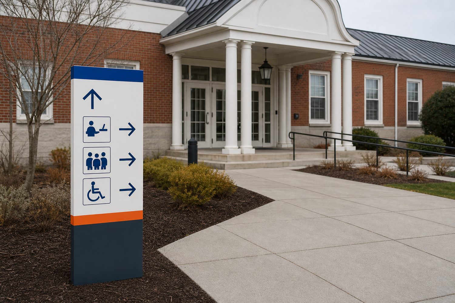
LEGIBILITY GUIDE
Distance, speed, angle and contrast shape legibility.
→Estimate, mock up, observe
A rough planning convention sometimes starts with viewing distance as a multiple of letter height, but there is no universal ratio that covers every font, user, speed or environment. Use estimates only to create a full-size test.
Measure where recognition must begin, not where a viewer finally stops.
A person walking, driving or searching under stress has different reading time.
More words require more time and usually more area. Edit before shrinking.
Compare luminance, finish and glare in the actual lighting—not just hue names.
Open counters, familiar forms, spacing and line length usually support fast recognition.
Print or project at full scale, place at the intended angle and ask representative users.
Distance-to-letter planning estimate
This is an educational starting point, not an ADA, traffic-control, building-code or permitting calculation.